

nitukothari02@gmail.com
7447655317
UX Analysis Case Study
Audit The Whole Truth Foods' website (thewholetruthfoods.com), specifically the product browse → add-to-cart → checkout flow. Identify 4-5 friction points or UX issues that could impact conversion rate. For 2 of these issues, design a proposed improvement in Figma
TASK 1


STEP 1
Before going into website auditing, we need to focus on the emotional state of our users
Awareness of the healthy lifestyle
Alert on knowing if the product is authentic
Need of transparency and trust
Our target users categorised into 2 user groups: Regular customer, First time users
Understanding these emotional states helps us identify the user’s intent while navigating the website, allowing us to design flows that guide them with clarity and confidence.

WALNUT FUDGE


We're re-building
the world's trust in food.
Why We exist -->
Explore Products
Explore Products -->
WALNUT FUDGE
protien bar

Home
Shop
Your Bars
New Launches
Our Story
Blogs



CRANBERRY RAISIN


We're re-building
the world's trust in food.
Why We exist -->
Explore Products
Explore Products -->
CRANBERRY RAISIN
protien bar
Home
Shop
Your Bars
New Launches
Our Story
Blogs


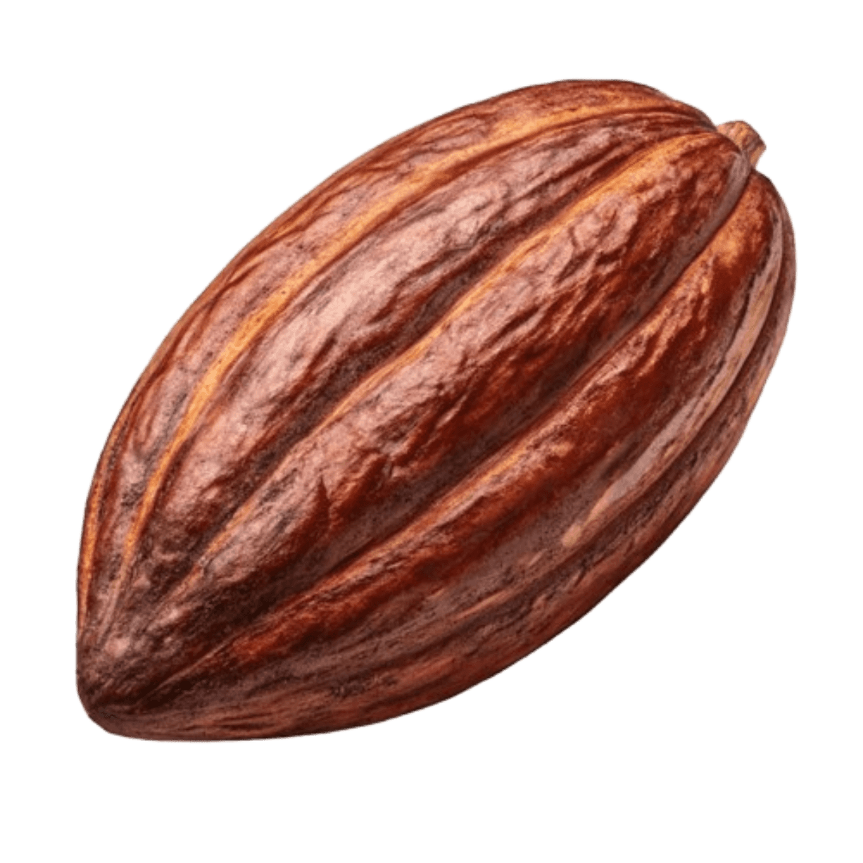
This is not just a home page, but an interactive hero section, on clicking on the screen the wheel will turn to introduct new products.
Because of this the users will be engaged to explore more with the available CTA
Home
Shop
Your Bars
New Launches
Our Story
Blogs

Shop Now
Changed the categorisation and also added shop now CTA on the banner
Proposed Design (Mobile View)


Explore Products
Explore Products -->
DOUBLE COCOA
protien bar
We're re-building
the world's trust in food.
Why We exist -->
Explore Products
Explore Products -->
WALNUT FUDGE
protien bar
We're re-building
the world's trust in food.
Why We exist -->


Explore Products
Explore Products -->
WALNUT FUDGE
protien bar
We're re-building
the world's trust in food.
Why We exist -->


Shop Now
PISTA BADAM
2,102/-
2,650/-
25g of protien
Pack of 1kg
Add to Cart

PISTA BADAM
2,102/-
2,650/-
25g of protien
Pack of 1kg
Add to Cart
PISTA BADAM
2,102/-
2,650/-
25g of protien
Pack of 1kg
Add to Cart
DOUBLE COCOA
1,905/-
2,650/-
25g of protien
Pack of 1kg
Add to Cart

DOUBLE COCOA
1,905/-
2,650/-
25g of protien
Pack of 1kg
Add to Cart
DOUBLE COCOA
1,905/-
2,650/-
25g of protien
Pack of 1kg
Add to Cart
TASK 2
Your GA4 shows that 42% of users land on the homepage, but only 18% click into a category page. Of those who do, only 8% complete a purchase. Heatmap data shows the category navigation menu has low click-through - users instead using the search bar. Session recordings reveal users are confused about the difference between similar products (e.g., Whey Protein vs. Plant Protein, or different protein bar flavors). The exit rate on category pages is 35%.
Task:
Diagnose the issue – Write 150–200 words on why category navigation is underperforming and how it impacts the funnel (consider: information overload, product differentiation, filtering options, trust signals)
Propose 3 design/UX changes — Could include: improved category page layout, better filtering, comparison tools, simplified navigation, product badge/labeling, etc.
Design 1 variant – Redesigned category page or navigation menu in Figma/free tool
Testing & insights plan – How would you test? What secondary metrics matter (e.g., time on category page, filter usage, comparison tool clicks)?
UX Changes
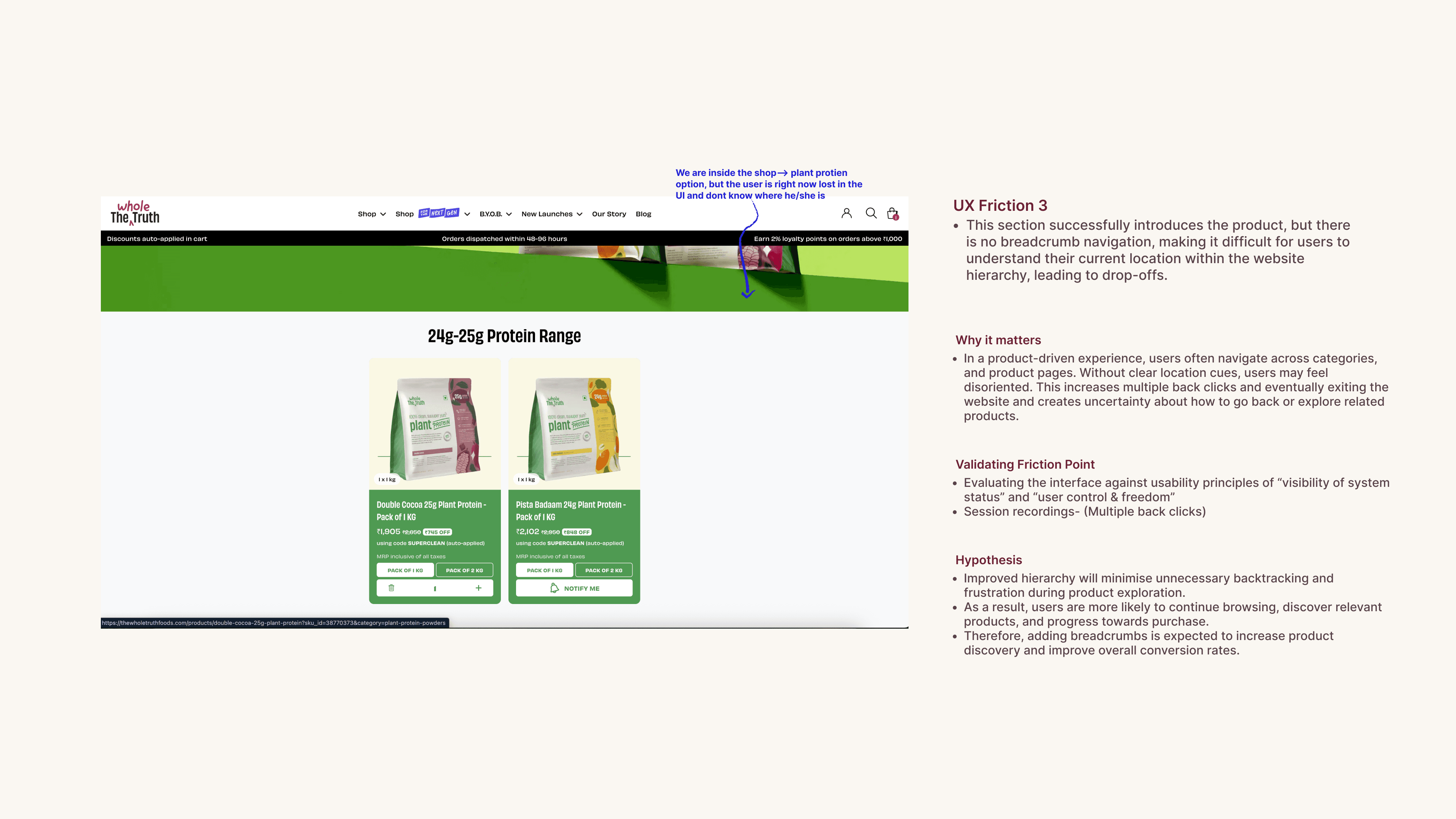
When I saw the Instagram page of TheWholeTruthFoods each post highlights the sensory feeling of taste where not just the product but the end result is depicted. same can be applied to the website as well.
Change hook images
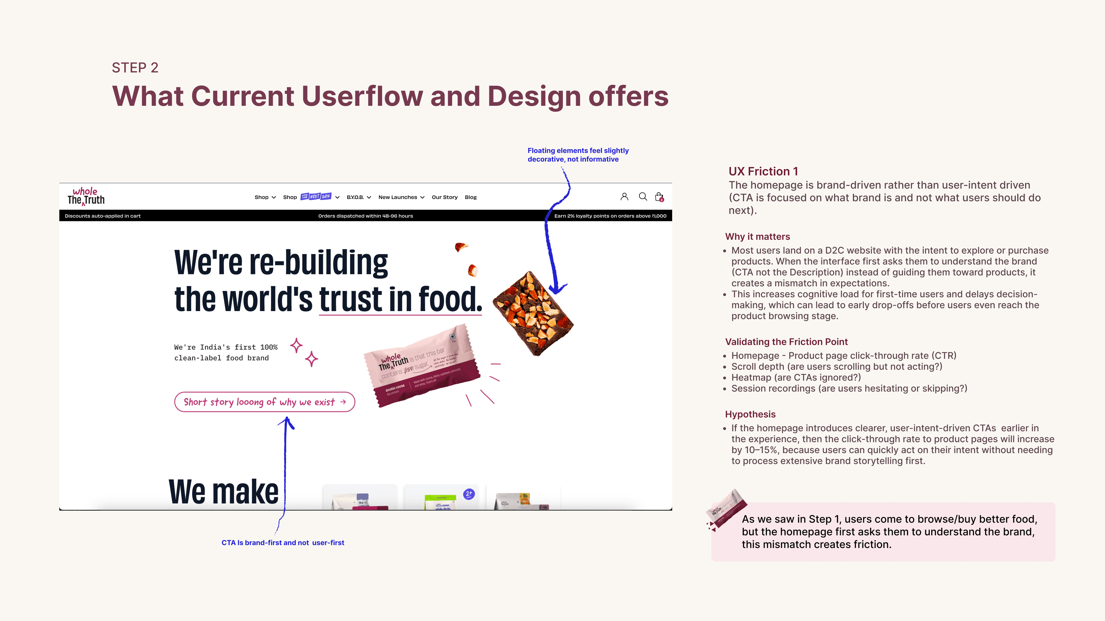
Adding CTA on the homepage to explore products is very useful method to navigate users to the categories page
Engaging the regular users from home page itself
Introduce filters like:
Goal: Weight Loss / Muscle Gain
Diet: Vegan / Dairy-Free
Flavour
Add a “Not sure what to choose?” helper
Helps first-time users who don’t know product name
Guided Filtering System
Why the category navigation page is underperforming
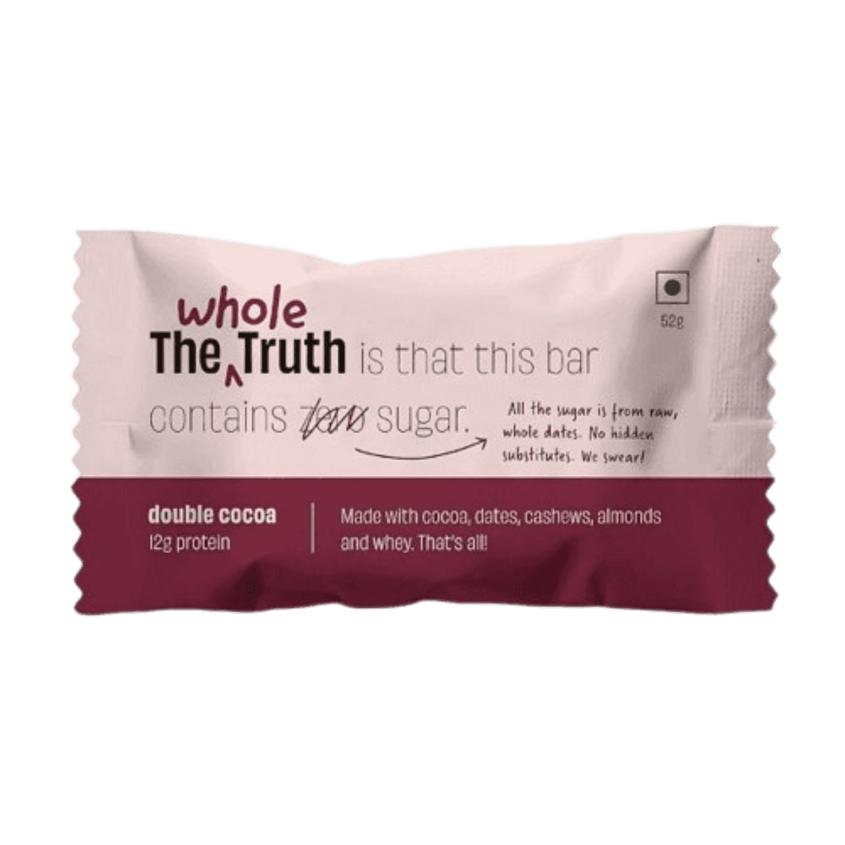
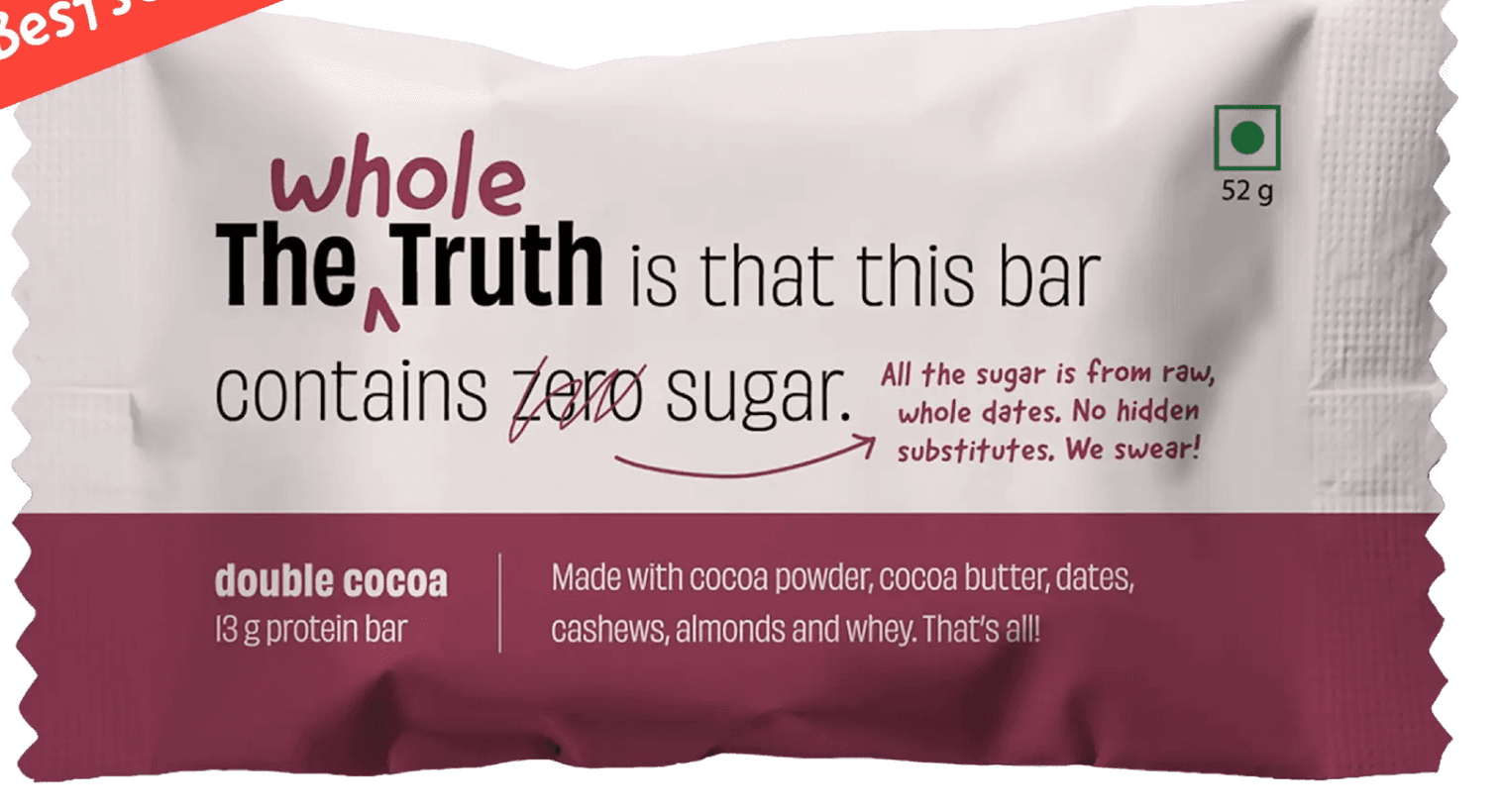
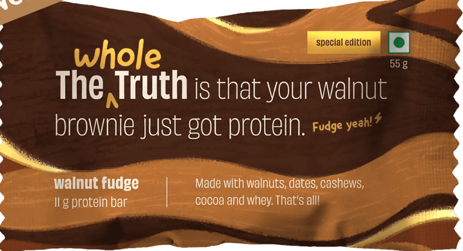
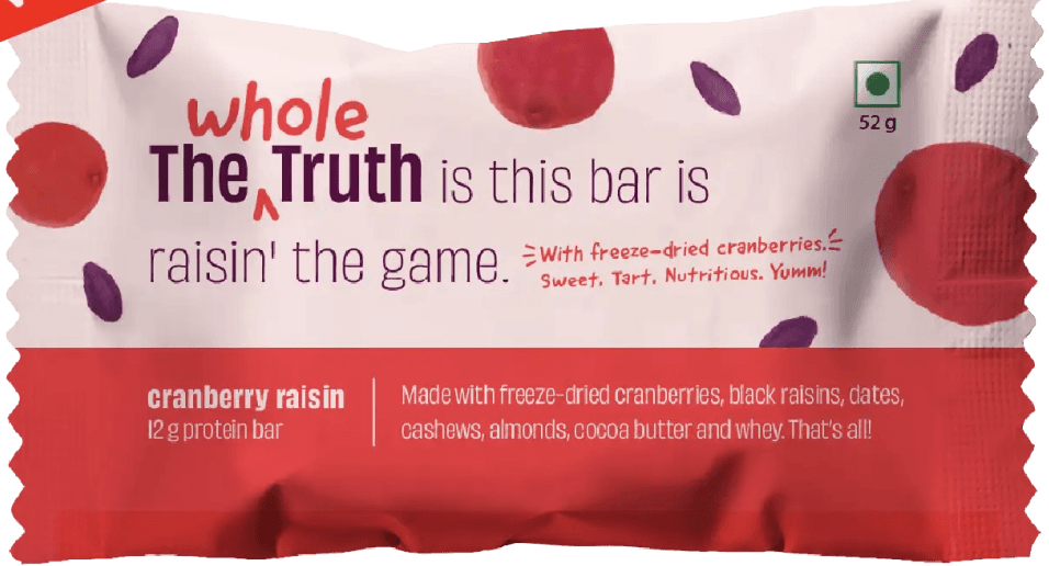
Categorisation page is underperforming and users are instead using search bar, this indicates these users are regular customers and not the first time users. New users (considering they have limited knowlegde about the product which is true for 70% of scenarios) gets confused because of the packaging. Don’t get me wrong, packaging design of the products are on point, but when users have options of multiple protein bars images having 95% same packaging confuses users in the decision making. Its not about the product, its about how users are feeling when they see the product. And what drives clicks is that we design for what users are feeling and not seeing.
THANK YOU